The State of Home Health Care in 7 Surprising Charts

You’ve heard it before…
Americans are getting older and living longer.
According to the US Census Bureau, the number of adults aged 65 and older is projected to increase at an annualized rate of more than 3%: 61.6 million during the five-year period to 2023.
By 2030, it is projected that 20% of Americans will be 65 or older. Within the population aged 65 and over, those 85 and over have experienced the most rapid growth.
This aging population will have important consequences to the economy – we are living longer with chronic health conditions and this places pressure on long term care.
The short story?

We are living longer, spending less time in hospitals / nursing homes as we age and die in our home; getting health care in the home (i.e. home health care) is cheaper and provides a better quality of living in our last years. PLUS there is a shortage, and great demand, for home health care professionals especially home health aides (HHA’s) and personal care assistants (PCA’s).
The charts below highlight trends in health care costs and home health care trends.
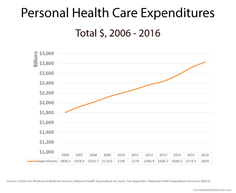
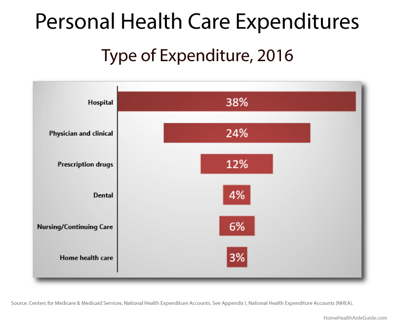
Personal Health Care Expenditures: 2006–2016
According to the Congressional Budget Office (CBO), future increases in health expenditures will be driven by three sources:
1. aging of the domestic population
2. rising spending on healthcare per person
3. Patient Protection and Affordable Care Act (PPACA)
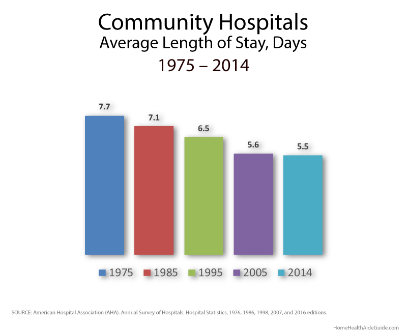
Hospital Stay
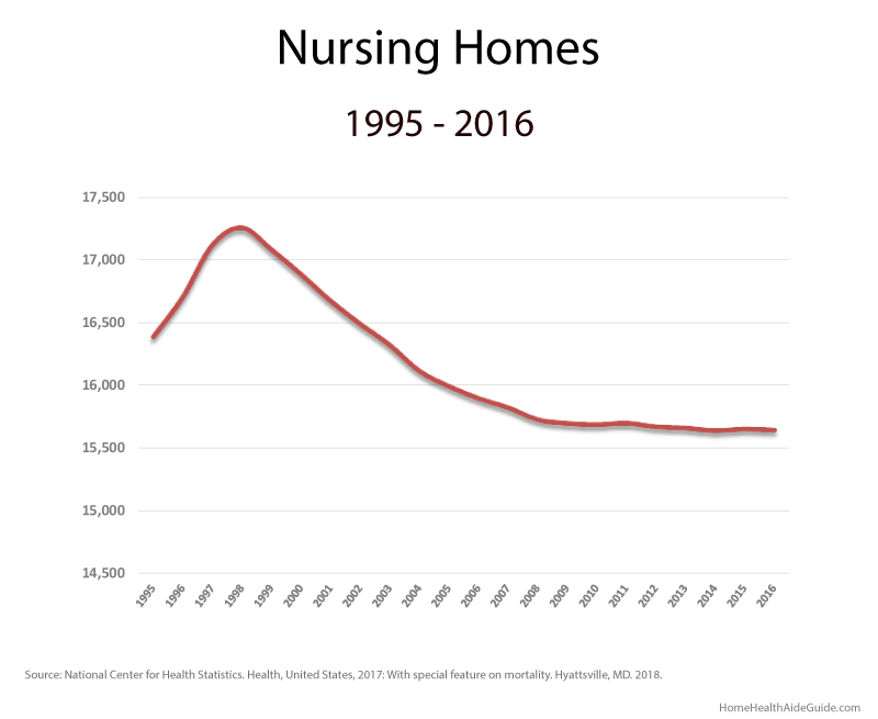
Nursing Homes
According to Centers for Medicare and Medicaid Services (CMS), more than 1.4 million people were living in nursing homes as of December 2014.
More than 88.0% of all nursing home residents are older than 65, while 45.0% are 85 or older.
The nursing home industry has reshaped itself as a result of unstable reimbursement rates, costly insurance and an unpredictable regulatory landscape.
Many companies were consolidated and acquired by others in an effort to cut costs (thin of centralized purchasing, information technology departments, etc.), they were able to increase occupancy rates, or at least stop them from declining, while reducing costs.
The number of nonprofit nursing homes declined 6.3% from 2010 to 2014, while for-profit nursing homes increased 1.6% during the same period.
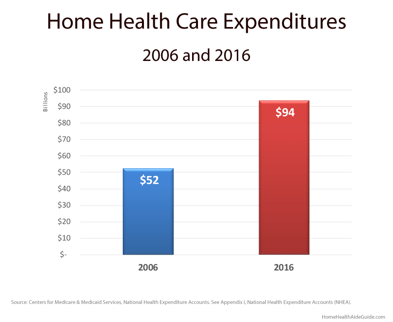
Home Health Care Expenditures
Home health care expenditures increased from $52.3 billion (2.9% of total personal health care expenditures) in 2006 to $93.5 billion (3.35 of total) in 2016.
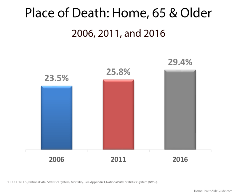
Place of Death
Most Americans express a preference to die in their homes; though most die in institutional settings (55%).
Between 2006 and 2016, the percentage of deaths occurring at home increased from 25.2% to 30.5%, while the percentage of deaths occurring in hospital inpatient settings declined from 36.4% to 29.4%
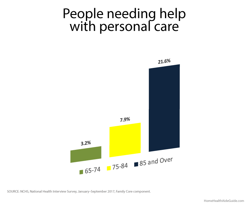
Help From Others
Adults aged 85 and over (21.6%) were more than twice as likely as adults aged 75–84 (7.9%) to need help with personal care from other persons.
No surprise that people aged 65 and over, the need for help with personal care from other persons increased with age.
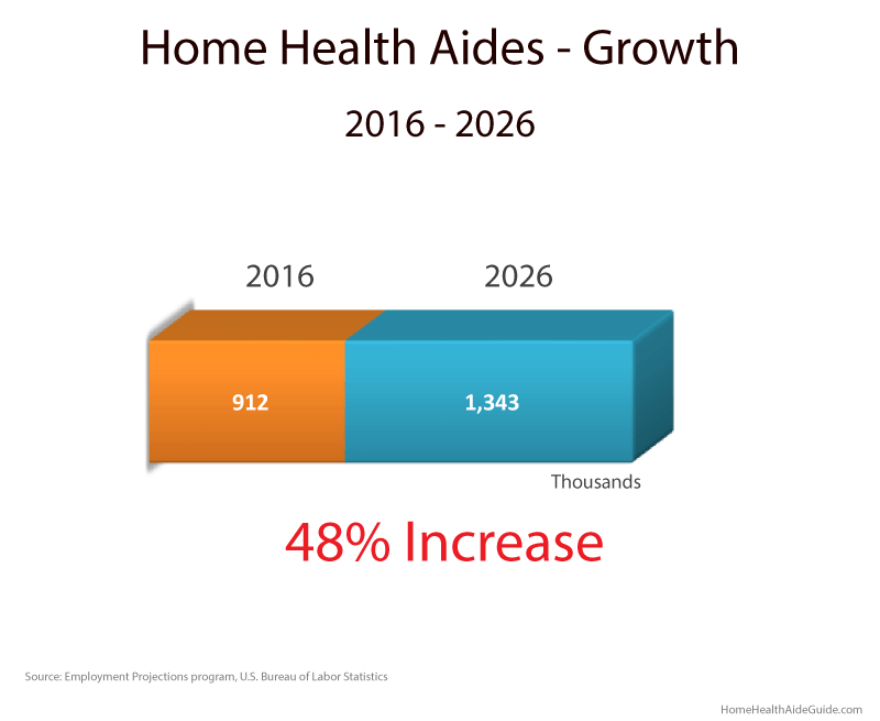
HHA Job Growth
We all know that fastest-growing jobs are in the health care industry and the even better news is that the expected growth of home health aides tops all other in the industry.
The home health aide occupation is projected to increase ~ 48% by 2026.
Almost three million (3,000,000) workers work in home health and personal care aide jobs. More than one million jobs will be added by 2026 – that’s a whole lot of jobs!